When people click the “Reserve” button, we’re now going to show a modal, to let people log in to the site.
Like they do on Airbnb, when you’re not logged in:
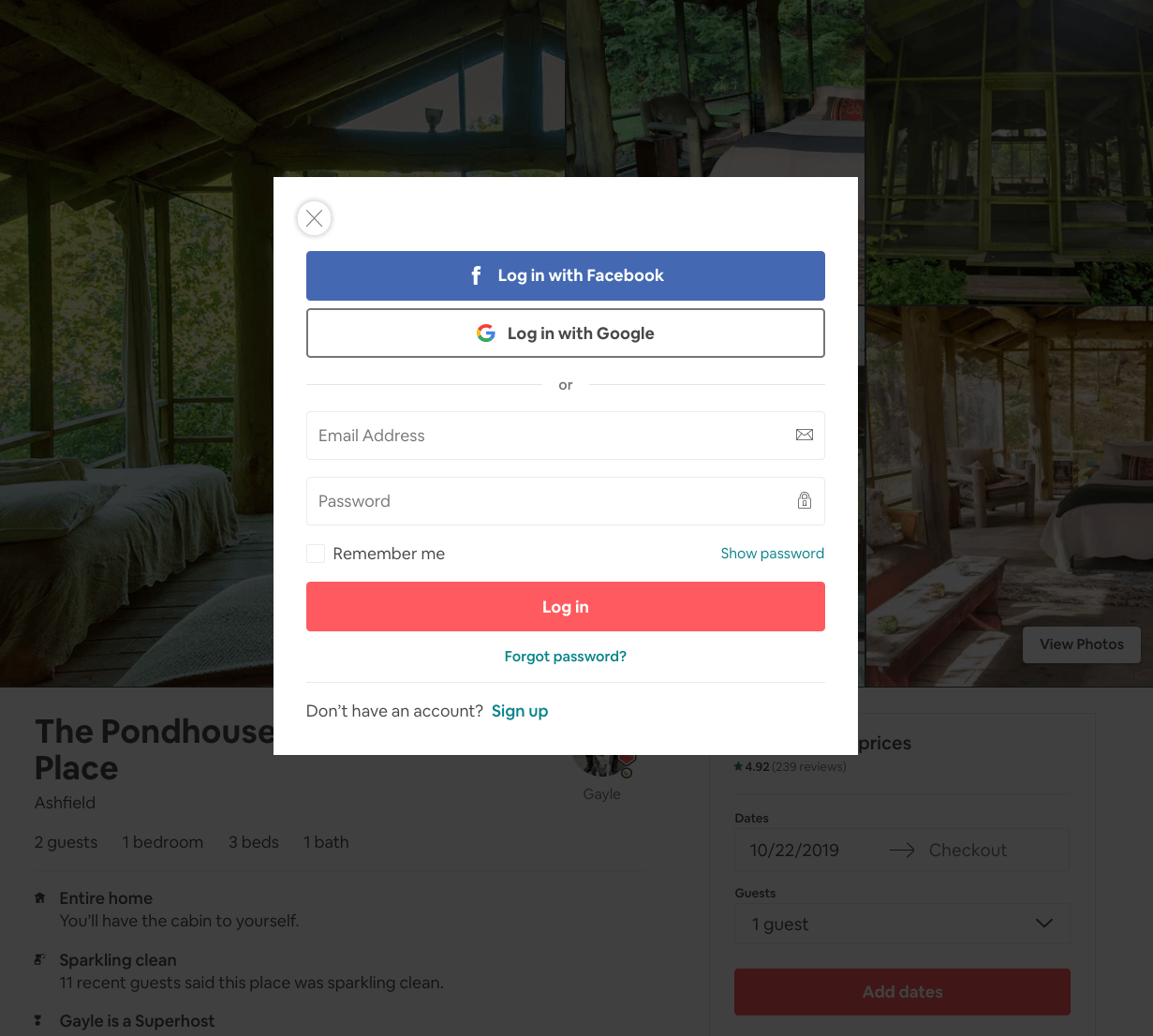
Right now we don’t have the option to log in, so people can’t be logged in - we don’t have a lot of logic we must implement. Let’s just show up a modal with the registration form.
Then we’ll add a “Already registered? Login in” link, which will just show the login and password fields.
We’ll skip the workflow to reset the password, which is something you’d need in production, but we can avoid now.
Let’s make the modal form.
We start simple, by creating a test modal. Make a components/Modal.js file, with this content:
components/Modal.js
export default props => (
  <div className='nav-container'>
    <div
      className='modal-background'
      onClick={() => console.log('close')}></div>

    <div className='modal'>{props.children}</div>
    <style jsx global>{`
      .modal-background {
        position: fixed;
        top: 0;
        left: 0;
        width: 100%;
        height: 100%;
        background: rgba(0, 0, 0, 0.3);
      }

      .modal {
        position: absolute;
        left: 50%;
        top: 50%;
        width: calc(100vw - 4em);
        max-width: 32em;
        max-height: calc(100vh - 4em);
        overflow: auto;
        transform: translate(-50%, -50%);
        padding: 1em;
        border-radius: 0.2em;
        background: white;
      }
    `}</style>
  </div>
)
This makes a simple modal component, that once imported can be used like this:
<Modal>test</Modal>
and it will render “test” inside a modal.
That’s what we’re going to do.
Open components/Layout.js, add
components/Layout.js
import { useState } from 'react'

import Modal from './Modal'
and then inside the component body, add
components/Layout.js
const [showModal, setShowModal] = useState(true)
and add this in the JSX, after the main tag:
components/Layout.js
{showModal && <Modal>test</Modal>}
This is the result that you should have if you try reloading the page:
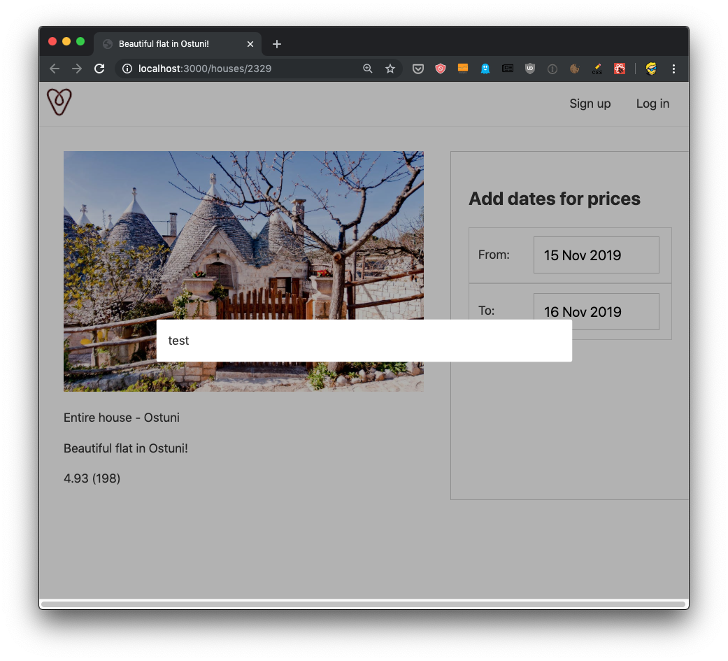
Awesome! Now we know the modal is working, in terms of the basic functionality we need.
If you click outside of the modal, nothing happens but you’ll get a “close” string in the console because we have this line:
components/Modal.js
<div
	className='modal-background'
	onClick={() => console.log('close')}></div>
Instead, let’s invoke a close prop, which we assume it’s a function passed to us by the parent component (Layout). We’ll handle closing the modal in that component, by using the setShowModal hook.
components/Modal.js
<div
	className='modal-background'
	onClick={() => props.close()}></div>
components/Layout.js
{showModal && <Modal close={() => setShowModal(false)}>test</Modal>}
Now you should be able to close the modal clicking outside it!
Now let’s create 2 specialized modals: components/RegistrationModal.js and components/LoginModal.js.
In their content, just add
components/RegistrationModal.js
export default () => <p>Registration Modal</p>
and
components/LoginModal.js
export default () => <p>Login Modal</p>
Everything we write inside the opening and closing <Modal> tags will be rendered in the modal, because we used props.children in the Modal component JSX, so just as we entered the test string, we can add another component.
In particular, we can add (depending on our goal) the RegistrationModal or the LoginModal components.
We add 2 more items in the Layout component state, using hooks like we did for showModal:
components/Layout.js
const [showLoginModal, setShowLoginModal] = useState(true)
const [showRegistrationModal, setShowRegistrationModal] = useState(false)
Notice I set showLoginModal to default to true, so we can default to showing the login modal for our testing purposes.
Now in the Layout component JSX instead of
{showModal && <Modal>test</Modal>}
we embed the LoginModal or RegistrationModal components depending on the component state:
{showModal && (
	<Modal close={() => setShowModal(false)}>
		{showLoginModal && <LoginModal />}
		{showRegistrationModal && <RegistrationModal />}
	</Modal>
)}
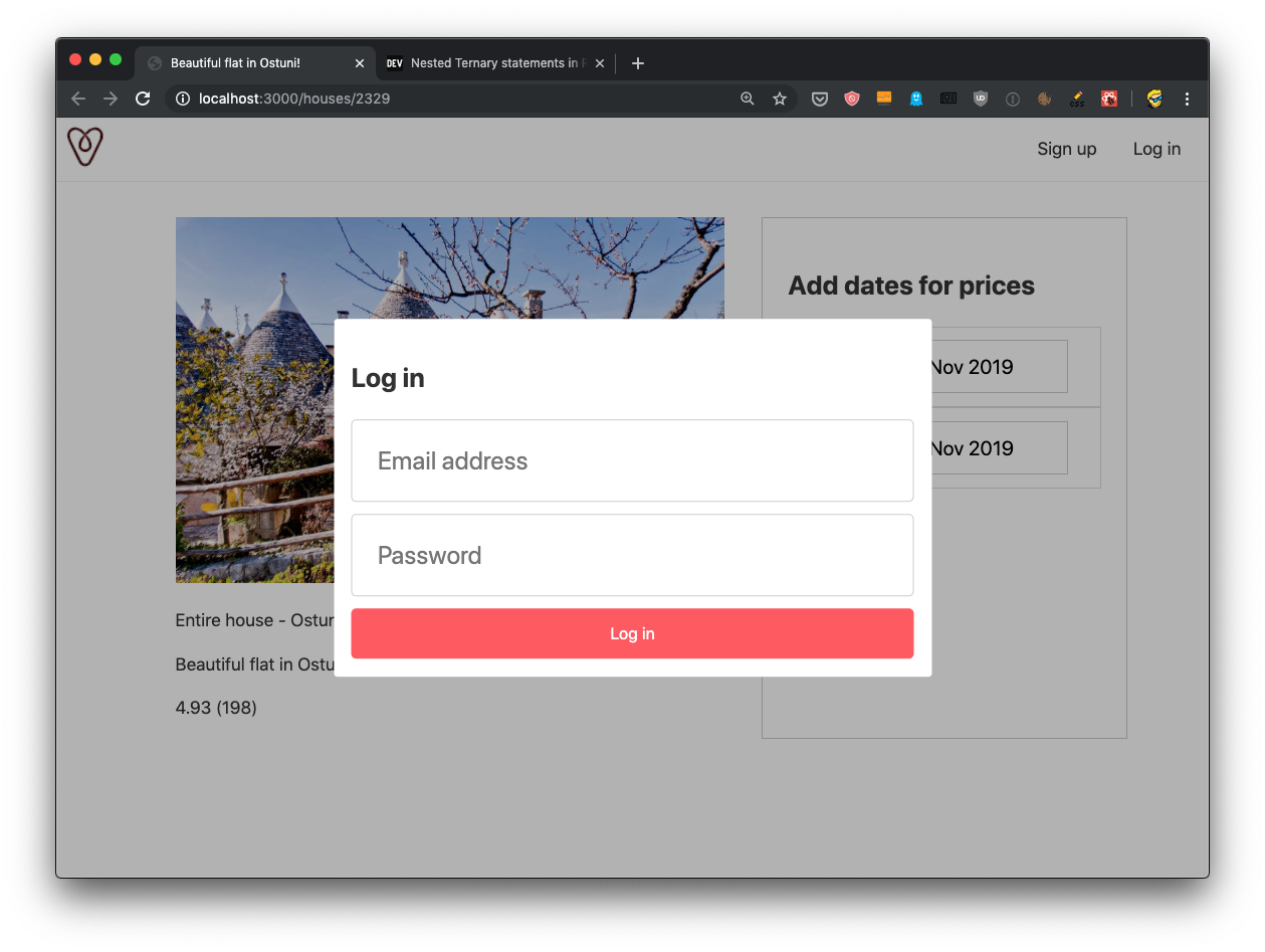
This should already display the Login component in the modal.
Now let’s define this Login component in details. We want to define a form with an email and password fields:
components/LoginModal.js
export default () => (
  <>
    <h2>Log in</h2>
    <div>
      <form>
        <input id='email' type='email' placeholder='Email address' />
        <input id='password' type='password' placeholder='Password' />
        <button>Log in</button>
      </form>
    </div>
  </>
)
This is just some basic HTML. We need some CSS, but since we are going to use the same CSS in the registration modal too, let’s add the CSS in the Layout component as part of the global styles:
button {
	background-color: rgb(255, 90, 95);
	color: white;
	font-size: 13px;
	width: 100%;
	border: none;
	height: 40px;
	border-radius: 4px;
	cursor: pointer;
}

input[type='text'],
input[type='email'],
input[type='password'] {
	display: block;
	padding: 20px;
	font-size: 20px !important;
	width: 100%;
	border: 1px solid #ccc;
	border-radius: 4px;
	box-sizing: border-box;
	margin-bottom: 10px;
}
Notice how the button stying is the same as the one we added in pages/houses/[id].js to style the “Reserve” button, so we can remove the corresponding CSS from that file, to avoid redundancy.
Things should look pretty good by now:
The registration component is going to be very similar:
export default () => (
  <>
    <h2>Sign up</h2>
    <div>
      <form>
        <input id='email' type='email' placeholder='Email address' />
        <input id='password' type='password' placeholder='Password' />
        <input
          id='passwordconfirmation'
          type='password'
          placeholder='Enter password again'
        />
        <button>Sign up</button>
      </form>
    </div>
  </>
)
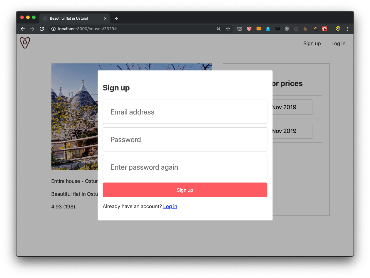
Now we add a way to go from one form to another by adding a link at the bottom of each form:
<p>
	Don't have an account yet?{' '}
	<a href='javascript:;' onClick={() => props.showSignup()}>Sign up</a>
</p>
and
<p>
	Already have an account? <a href='javascript:;' onClick={() => props.showLogin()}>Log in</a>
</p>
I used javascript:; as the href value, to tell the browser we’ll use JS to handle the click, and simultaneously avoid the URL to change if I use href="#". See https://flaviocopes.com/links-for-javascript/ for more info on this method I used.
Notice how we call props.showSignup() and props.showLogin(). Those are 2 functions we pass as props from the parent component, Layout.
Don’t forget to change export default () => ... to export default props => ... in LoginModal.js and RegistrationModal.js, because previously we didn’t have any props, but now we must declare we receive the props as a parameter.
Now in Layout.js we handle for each component the corresponding prop:
{showModal && (
	<Modal close={() => setShowModal(false)}>
		{showLoginModal && (
			<LoginModal
				showSignup={() => {
					setShowRegistrationModal(true)
					setShowLoginModal(false)
				}}
			/>
		)}
		{showRegistrationModal && (
			<RegistrationModal
				showLogin={() => {
					setShowRegistrationModal(false)
					setShowLoginModal(true)
				}}
			/>
		)}
	</Modal>
)}
You can try the frontend, you should be able to switch between the forms:
Let’s add a form submit event, by adding an event handler to the onSubmit event on the form tags in both forms:
<form
	onSubmit={event => {
		alert('Log in!')
		event.preventDefault()
	}}>
	...
and in the registration form:
<form
	onSubmit={event => {
		alert('Sign up!')
		event.preventDefault()
	}}>
	...
Here’s the full LoginModal.js component
export default props => (
  <>
    <h2>Log in</h2>
    <div>
      <form
        onSubmit={event => {
          alert('Log in!')
          event.preventDefault()
        }}>
        <input id='email' type='email' placeholder='Email address' />
        <input id='password' type='password' placeholder='Password' />
        <button>Log in</button>
      </form>
      <p>
        Don't have an account yet?{' '}
        <a href='javascript:;' onClick={() => props.showSignup()}>
          Sign up
        </a>
      </p>
    </div>
  </>
)
and here’s the full RegistrationModal.js component:
export default props => (
  <>
    <h2>Sign up</h2>
    <div>
      <form
        onSubmit={event => {
          alert('Sign up!')
          event.preventDefault()
        }}>
        <input id='email' type='email' placeholder='Email address' />
        <input id='password' type='password' placeholder='Password' />
        <input
          id='passwordconfirmation'
          type='password'
          placeholder='Enter password again'
        />
        <button>Sign up</button>
      </form>
      <p>
        Already have an account?{' '}
        <a href='javascript:;' onClick={() => props.showLogin()}>
          Log in
        </a>
      </p>
    </div>
  </>
)
Great!
In the next lesson we’ll link these modals to the rest of the application.
The code for this lesson is available at https://github.com/flaviocopes/airbnb-clone-react-nextjs/commit/8c82646a03ac3bff3ba545edee471b1fd3b9ec5d