Now that we have the react-day-picker library in place, we can start using it.
Let’s first define a component to hold it. We call it DateRangePicker. I give it this name since we must define the range of dates for the booking.
Create a components/DateRangePicker.js file. In it, we import the react-day-picker component, and we just output a string to make sure our component displays in the page:
import DayPickerInput from 'react-day-picker/DayPickerInput'

export default () => (
  <div>
    <DayPickerInput />
  </div>
)
Import this in the pages/houses/[id].js file:
pages/houses/[id].js
//...
import DateRangePicker from '../../components/DateRangePicker'

const House = props => (
  <Layout
    content={
      <div className='container'>
        ...
        <aside>
          <h2>Add dates for prices</h2>
          <DateRangePicker />
        </aside>
        ...
      </div>
    }
  />
)
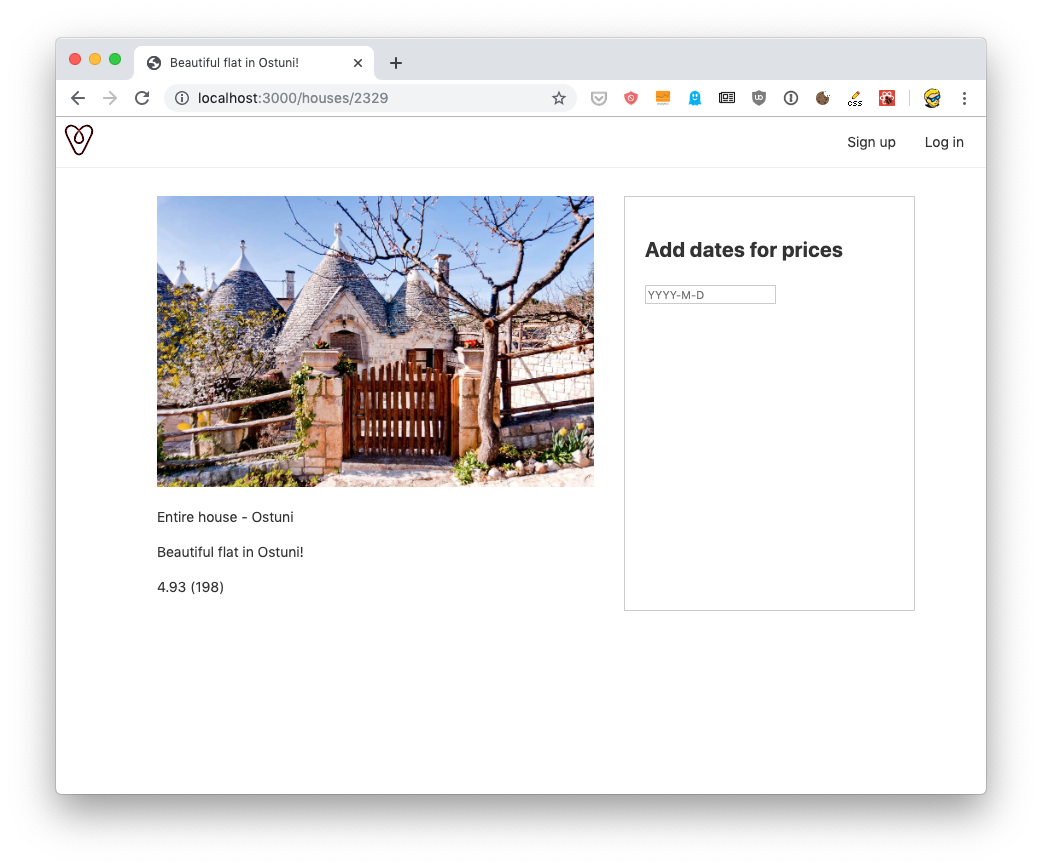
Here’s the output
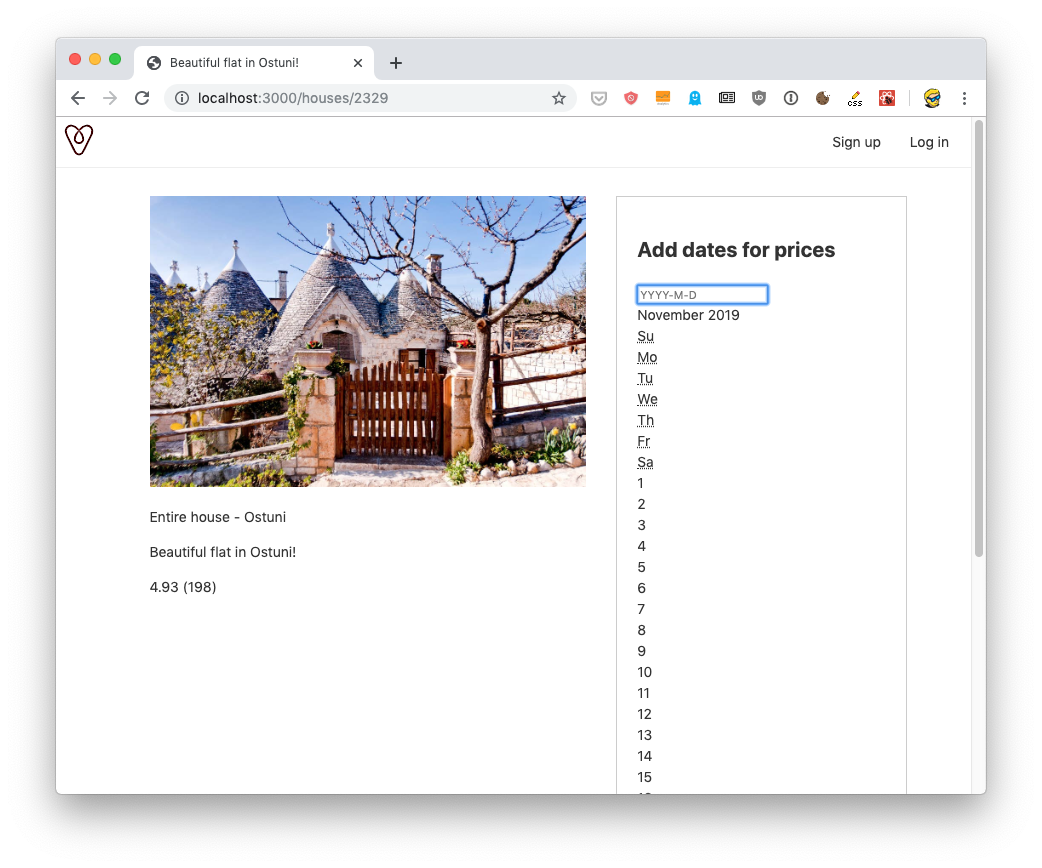
But if you click the input element, ooops:
Go back to components/DateRangePicker.js and also import the component’s CSS file:
components/DateRangePicker.js
import DayPickerInput from 'react-day-picker/DayPickerInput'
import 'react-day-picker/lib/style.css'

export default () => (
  <div>
    <DayPickerInput />
  </div>
)
Another oops:
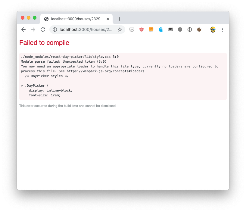
We have a problem here. Next.js can’t just import CSS like that. We need to first tell it how to handle CSS files.
We do so by installing @zeit/next-css:
npm install @zeit/next-css
and then by creating a configuration file in the root of the project, called next.config.js, with this content:
next.config.js
const withCSS = require('@zeit/next-css')
module.exports = withCSS()
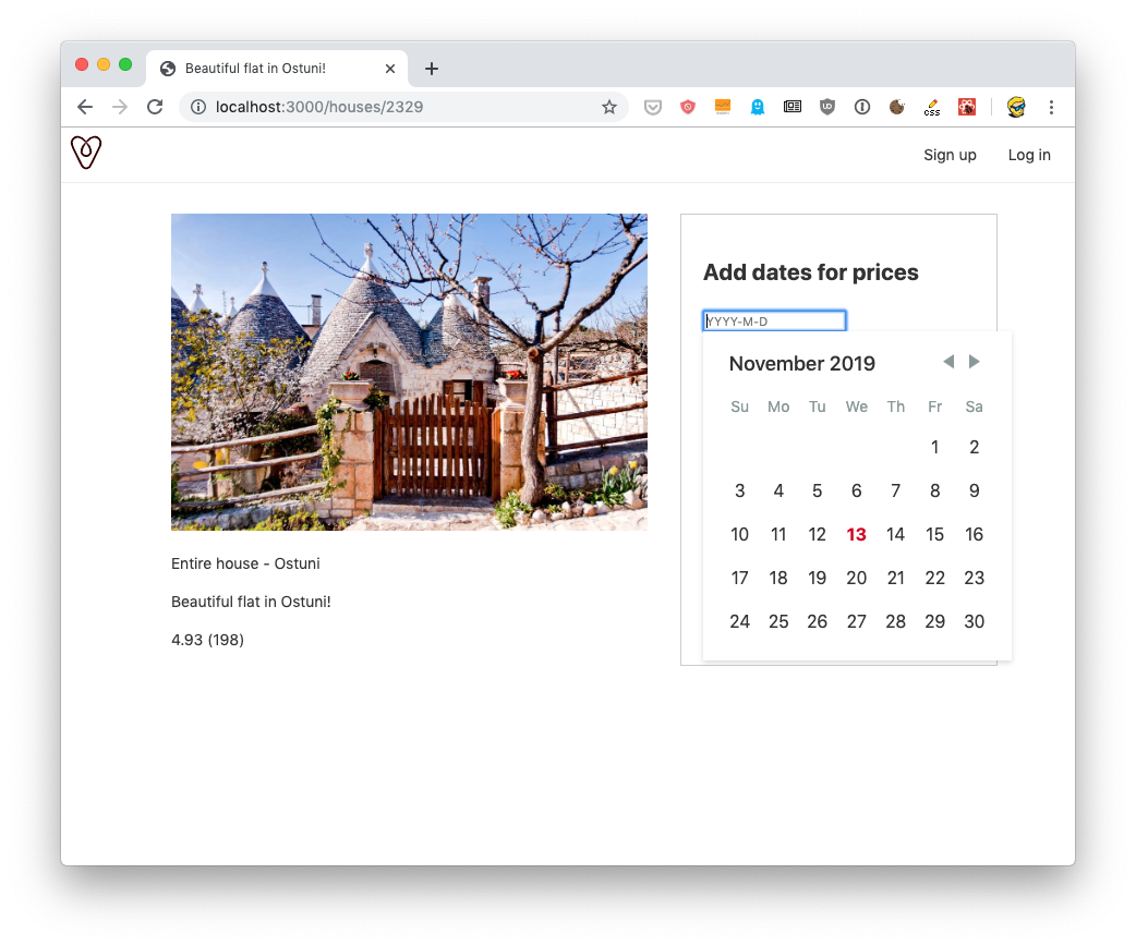
Cool! Now we can restart Next.js using npm run dev and we’ll get the date picker rendered nicely:
Great!
Now let’s go back to our components/DateRangePicker.js file. We need to have a “check-in” box, and a “check-out” box. We can put them in 2 separate rows, with 2 labels:
export default () => (
  <div className='date-range-picker-container'>
    <div>
      <label>From:</label>
      <DayPickerInput />
    </div>
    <div>
      <label>To:</label>
      <DayPickerInput />
    </div>
  </div>
)
Let’s add this bit of CSS to display this markup nicely:
<style jsx>{`
  .date-range-picker-container div {
    display: grid;
    border: 1px solid #ddd;
    grid-template-columns: 30% 70%;
    padding: 10px;
  }
  label {
    padding-top: 10px;
  }
`}</style>
<style jsx global>{`
  .DayPickerInput input {
    width: 120px;
    padding: 10px;
    font-size: 16px;
  }
`}</style>
This should be the final result of our lesson:

The code for this lesson is available at https://github.com/flaviocopes/airbnb-clone-react-nextjs/commit/f99bcfa88347d2fec4501a30aaa2567c14ae1783